
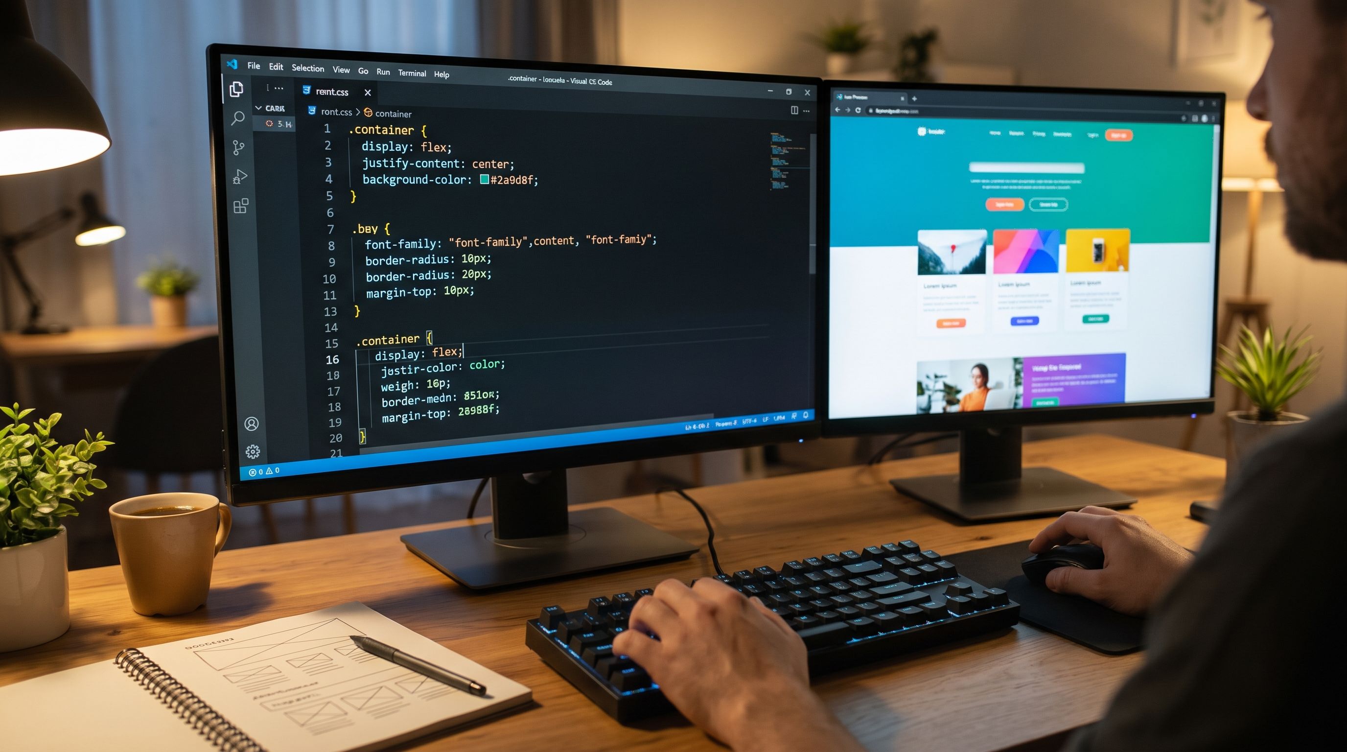
Designing a website using CSS is the defining step that transforms a web page from a rigid, uninspiring text document into an interactive visual experience that captures attention and turns visitors into loyal customers. If HTML serves as the structural skeleton of a website, CSS (Cascading Style Sheets) is the soul, color palette, interior design, and architectural facade that gives a brand its unique digital identity.
In today’s digital landscape, users judge a website's credibility within just 0.05 seconds of landing on a page—and 94% of that first impression is driven by visual design, layout harmony, and responsiveness. In this comprehensive guide, we will walk you through everything from CSS fundamentals and real-world code implementation to modern responsive layouts, an in-depth pros-and-cons analysis of CSS methodologies, and Technical SEO optimization for top Google rankings.
Table of Contents
What Is CSS and Why Can’t You Design a Website Without It?
CSS stands for Cascading Style Sheets. It is the standard styling language used to describe how HTML elements should be rendered on screen—whether on a desktop monitor, smartphone, or tablet.
The core benefits of designing a website using CSS include:
- Separation of Content and Presentation: CSS allows you to keep your content structured in clean HTML files while housing all layout, color, and typography rules in a single external stylesheet. You can redesign a 1,000-page website globally just by editing one CSS file.
- Exceptional User Experience (UX): CSS controls whitespace, color contrast, fluid typography, and micro-interactions (such as button hover states), making navigation intuitive and visually engaging.
- Multi-Device Responsiveness: Using CSS Media Queries and modern layout modules, your website automatically adapts to any screen resolution without needing a separate mobile domain.
- Faster Page Load Speeds: Replacing heavy graphical assets with native CSS3 effects (like linear gradients, box shadows, and smooth transitions) drastically reduces page weight and speeds up rendering.
How Does CSS Work? (Code Anatomy & Integration Methods)
To master website design using CSS, you first need to understand the anatomy of a CSS Rule-set, which consists of three foundational parts:
- The Selector: Targets the HTML element you want to style (e.g., an
h1heading, apparagraph, or a custom class like.card). - The Property: Specifies the visual attribute you want to modify (such as
color,font-size, orbackground-color). - The Value: Defines the setting assigned to the property (such as
#2563ebfor blue or18pxfor size).
/* Example of CSS Rule-set Anatomy */
.hero-title {
  color: #1a202c;       /* Property: Color | Value: Dark Slate */
  font-size: 32px;      /* Property: Font Size | Value: 32 Pixels */
  font-weight: bold;    /* Property: Font Weight | Value: Bold */
}
3 Ways to Connect CSS to an HTML Page
While there are three ways to insert CSS into a web project, only one method is considered the gold standard for scalable, SEO-friendly production websites:
| Integration Method | How It Works | Best Use Case | SEO & Performance Rating |
|---|---|---|---|
| External CSS | Written in a separate .css file and linked via the <link> tag inside <head>. |
All professional websites, e-commerce stores, and web apps. | Excellent (Enables browser caching and keeps HTML lightweight). |
| Internal CSS | Placed inside a <style> block within the HTML document’s <head>. |
Single landing pages or injecting above-the-fold Critical CSS. | Moderate (Increases HTML document size if overused). |
| Inline CSS | Applied directly to an HTML element using the style="" attribute. |
HTML email templates or dynamic JavaScript style overrides. | Poor (Creates code bloat and is difficult to maintain). |
Step-by-Step Guide to Designing a Website Using CSS and HTML
Let’s move from theory to hands-on practice. Below, we will build a clean, modern landing page featuring a sticky navigation bar (Navbar), a Hero Section, and a responsive Services Grid.
Step 1: Build the Semantic HTML5 Structure
First, create an index.html file using semantic HTML5 landmarks (<header>, <nav>, <section>). Search engines rely on these tags to understand your page hierarchy:
<!DOCTYPE html>
<html lang="en">
<head>
  <meta charset="UTF-8">
  <meta name="viewport" content="width=device-width, initial-scale=1.0">
  <title>Modern Website Design Using CSS</title>
  <!-- Link External Stylesheet -->
  <link rel="stylesheet" href="style.css">
</head>
<body>

  <!-- Top Navigation Bar -->
  <header class="navbar">
    <div class="logo">UniqueDesign</div>
    <nav class="nav-links">
      <a href="#home">Home</a>
      <a href="#services">Services</a>
      <a href="#portfolio">Portfolio</a>
      <a href="#contact" class="btn-nav">Contact Us</a>
    </nav>
  </header>

  <!-- Hero Section -->
  <section id="home" class="hero">
    <div class="hero-content">
      <span class="badge">Modern Web Architecture</span>
      <h1>Transforming Your Vision Into Reality With CSS</h1>
      <p>We craft blazing-fast, mobile-responsive user interfaces engineered to rank high on search engines and convert visitors.</p>
      <a href="#contact" class="btn-primary">Start Your Project</a>
    </div>
  </section>

  <!-- Services Grid Section -->
  <section id="services" class="services">
    <h2>Our Core Services</h2>
    <div class="services-grid">
      <div class="card">
        <h3>UI/UX Design</h3>
        <p>Intuitive, conversion-focused interfaces tailored to your brand identity.</p>
      </div>
      <div class="card">
        <h3>Responsive Development</h3>
        <p>Pixel-perfect layouts that adapt effortlessly across mobile, tablet, and desktop.</p>
      </div>
      <div class="card">
        <h3>Speed & Technical SEO</h3>
        <p>Clean, lightweight code optimized for Google Core Web Vitals.</p>
      </div>
    </div>
  </section>

</body>
</html>
Step 2: Apply a CSS Reset & Define Brand Variables
Beginners often forget that browsers apply default margins and paddings that can break layouts. Professional developers always start their style.css file with a universal reset and define CSS Custom Properties (Variables) for effortless global theming:
/* 1. Universal CSS Reset */
* {
  margin: 0;
  padding: 0;
  box-sizing: border-box;
}

/* 2. Define Global Brand Variables */
:root {
  --primary-color: #2563eb;    /* Primary Brand Blue */
  --secondary-color: #1e40af;  /* Hover State Dark Blue */
  --text-dark: #0f172a;        /* Main Heading & Body Text */
  --text-muted: #475569;       /* Subtitle & Muted Text */
  --bg-light: #f8fafc;         /* Soft Background Color */
  --white: #ffffff;
  --radius: 12px;              /* Standard Border Radius */
  --transition: all 0.3s ease; /* Smooth Animation Curve */
}

body {
  font-family: 'Plus Jakarta Sans', sans-serif;
  background-color: var(--bg-light);
  color: var(--text-dark);
  line-height: 1.7;
}
💡 Pro Developer Tip: Setting box-sizing: border-box; is essential in modern CSS. It ensures that an element's padding and border are included within its declared width, preventing unexpected horizontal scrollbars and broken grids.
Step 3: Style the Navigation Bar Using Flexbox
CSS Flexbox is the ideal layout module for one-dimensional alignment. Here, we use it to place the brand logo on the left and navigation links on the right in a single clean row:
.navbar {
  display: flex;
  justify-content: space-between;
  align-items: center;
  padding: 1.2rem 8%;
  background-color: var(--white);
  box-shadow: 0 2px 15px rgba(0, 0, 0, 0.04);
  position: sticky;
  top: 0;
  z-index: 1000;
}

.logo {
  font-size: 1.5rem;
  font-weight: 800;
  color: var(--primary-color);
}

.nav-links {
  display: flex;
  gap: 2rem;
  align-items: center;
}

.nav-links a {
  text-decoration: none;
  color: var(--text-dark);
  font-weight: 600;
  transition: var(--transition);
}

.nav-links a:hover {
  color: var(--primary-color);
}

.btn-nav {
  background-color: var(--primary-color);
  color: var(--white) !important;
  padding: 0.6rem 1.4rem;
  border-radius: var(--radius);
}
Step 4: Design the Hero Section & Responsive CSS Grid
To create a multi-column card layout that automatically wraps on smaller screens without writing dozens of media queries, we use CSS Grid with the powerful repeat(auto-fit, minmax()) function:
/* Hero Section Styling */
.hero {
  min-height: 80vh;
  display: flex;
  align-items: center;
  justify-content: center;
  text-align: center;
  padding: 4rem 8%;
  background: linear-gradient(135deg, #eff6ff 0%, #ffffff 100%);
}

.hero-content {
  max-width: 750px;
}

.badge {
  background-color: #dbeafe;
  color: var(--primary-color);
  padding: 0.4rem 1rem;
  border-radius: 50px;
  font-size: 0.9rem;
  font-weight: 700;
  display: inline-block;
  margin-bottom: 1rem;
}

.hero h1 {
  font-size: 2.8rem;
  margin-bottom: 1.2rem;
  line-height: 1.25;
}

.hero p {
  color: var(--text-muted);
  font-size: 1.15rem;
  margin-bottom: 2rem;
}

.btn-primary {
  display: inline-block;
  background-color: var(--primary-color);
  color: var(--white);
  padding: 0.9rem 2.2rem;
  border-radius: 12px;
  text-decoration: none;
  font-weight: 700;
  transition: var(--transition);
}

.btn-primary:hover {
  background-color: var(--secondary-color);
  transform: translateY(-3px);
}

/* Smart Responsive Services Grid */
.services {
  padding: 5rem 8%;
  text-align: center;
}

.services h2 {
  font-size: 2rem;
  margin-bottom: 3rem;
}

.services-grid {
  display: grid;
  grid-template-columns: repeat(auto-fit, minmax(280px, 1fr));
  gap: 2rem;
}

.card {
  background: var(--white);
  padding: 2.5rem 2rem;
  border-radius: var(--radius);
  box-shadow: 0 4px 20px rgba(0, 0, 0, 0.05);
  transition: var(--transition);
}

.card:hover {
  transform: translateY(-8px);
  box-shadow: 0 12px 25px rgba(37, 99, 235, 0.1);
}
Step 5: Make It Mobile-Friendly with Media Queries
With over 70% of global web traffic coming from mobile devices, responsive adjustments are mandatory. Add a @media rule at the bottom of your stylesheet to stack the navigation bar and scale typography on smaller screens:
@media (max-width: 768px) {
  .navbar {
    flex-direction: column;
    gap: 1rem;
  }

  .nav-links {
    flex-wrap: wrap;
    justify-content: center;
    gap: 1rem;
  }

  .hero h1 {
    font-size: 2rem;
  }
}
Strengths & Weaknesses: Comparing CSS Design Methodologies
When building a modern web application, developers choose between three primary styling approaches: writing Vanilla CSS from scratch, using component libraries like Bootstrap, or adopting utility-first frameworks like Tailwind CSS. Understanding the strengths and weaknesses of each prevents costly refactoring down the road:
1. Custom Vanilla CSS
✅ Strengths (Pros)
- 100% Creative Control: Zero framework constraints; build bespoke layouts freely.
- Peak Performance: Extremely lightweight file size with zero unused styles.
- Zero Dependencies: Immune to breaking changes from third-party updates.
❌ Weaknesses (Cons)
- Slower Initial Development: Every button, grid, and modal must be coded from scratch.
- Maintenance Complexity at Scale: Requires strict naming conventions (like BEM) across large teams.
2. Component Libraries (e.g., Bootstrap)
✅ Strengths (Pros)
- Rapid Prototyping: Pre-built UI components work right out of the box.
- Cross-Browser Consistency: Pre-tested across legacy and modern browsers alike.
❌ Weaknesses (Cons)
- Generic Look: Websites built with Bootstrap often look repetitive and lack unique branding.
- Unused Code Bloat: Loading a massive stylesheet when you only use 15% of its classes hurts page speed.
3. Utility-First Frameworks (Tailwind CSS)
✅ Strengths (Pros)
- Gold Standard for Next.js & React: Combines rapid development with complete design customization.
- Tiny Production Bundle: Automatically strips out unused CSS classes at build time.
❌ Weaknesses (Cons)
- Initial Learning Curve: Requires memorizing utility class names and build-tool setup.
- Verbose HTML Markup: Elements with many utility classes can look crowded until extracted into components.
| Comparison Metric | Vanilla CSS | Bootstrap | Tailwind CSS |
|---|---|---|---|
| Page Speed & Core Web Vitals | Excellent (98%+) | Moderate (Requires purging) | Excellent (99%+) |
| Visual Uniqueness & Branding | 100% Bespoke | Generic / Repetitive | 100% Bespoke |
| Development Speed | Slow to Moderate | Very Fast | Fast |
| Best Suited For: | Custom creative sites & lightweight pages | Internal dashboards & quick MVPs | Scalable production web apps & Next.js projects |
How CSS Directly Impacts Your Google Rankings (Technical SEO)
Many site owners assume SEO is purely about keywords and backlinks. However, Google’s Core Web Vitals are official ranking signals heavily governed by how your CSS is architected:
- Preventing Cumulative Layout Shift (CLS): Have you ever tried to tap a button on a webpage, only for the layout to suddenly jump because an image loaded late? Google penalizes high CLS scores. Defining explicit dimensions and using the CSS
aspect-ratioproperty reserves space before assets load, keeping your layout rock-solid. - Optimizing Largest Contentful Paint (LCP): By default, CSS files are render-blocking resources—browsers will not paint anything on screen until the stylesheet is downloaded and parsed. Minifying CSS and inlining Critical CSS ensures instantaneous above-the-fold rendering.
- Enhancing Web Accessibility (a11y): Proper color contrast ratios, visible focus states (
:focus-visible), and scalable typography directly boost your Google Lighthouse Accessibility score and improve user retention.
Common CSS Mistakes to Avoid in Web Design
To ensure your codebase remains clean, scalable, and fast, avoid these frequent pitfalls we encounter during technical site audits:
- Overusing
!important: Forcing style overrides breaks the natural cascading specificity of CSS and turns future maintenance into a debugging nightmare. - Hardcoding Fixed Pixel (
px) Values Everywhere: Relying strictly on pixels prevents layouts from scaling smoothly with user browser settings. Use relative units likeremfor typography/spacing and%,vw, orvhfor fluid containers. - Ignoring Logical Properties for Multi-Language Sites: If your website supports both English (LTR) and Arabic (RTL), avoid physical properties like
margin-leftorpadding-right. Instead, use CSS Logical Properties likemargin-inline-startandpadding-inline-end, which flip automatically based on language direction! - Loading Uncompressed Web Fonts: Heavy
.ttffont files slow down page rendering. Always serve modernWOFF2font formats and declarefont-display: swap;in your@font-facerules.
When to Code Yourself vs. Hiring a Professional Web Design Agency
Learning how to design a website using CSS is an empowering skill. If you are building a personal portfolio, a hobby blog, or practicing frontend development, following the steps in this guide will give you a solid foundation.
However, if you are a business owner, medical clinic, e-commerce brand, or growing enterprise, your website is more than just a digital brochure—it is your primary revenue engine. A high-performing commercial platform requires:
- A modern full-stack architecture combining ultra-fast frontend frameworks (like Next.js and Tailwind CSS) with a flexible Headless CMS.
- Deep Technical SEO architecture, custom Schema markup, and sub-second load times that outperform competitors from day one.
- Conversion Rate Optimization (CRO) rooted in user psychology, enterprise security, and seamless third-party integrations.
Partnering with a specialized engineering and design team saves months of trial and error, delivering a scalable digital asset built to dominate search rankings and maximize ROI.
Frequently Asked Questions About Designing Websites with CSS (FAQ)
Is CSS alone enough to design a complete website?
CSS cannot be used entirely on its own; it requires HTML to build the core page structure and elements. Using HTML and CSS together, you can build a complete, attractive static website. However, for dynamic interactions (such as smart filters or interactive menus) you will need JavaScript, and for database integration and content management, you will need advanced technologies like Next.js or WordPress.
How long does it take to learn website design using CSS?
You can learn CSS fundamentals and build your first simple web page within 1 to 2 weeks of daily practice. Mastering advanced layouts (Flexbox & Grid), smooth animations, and professional responsive design across all screens typically takes 2 to 3 months of hands-on project work.
Which is better for web design: Flexbox or CSS Grid?
Neither is strictly better than the other—they complement each other. Flexbox is designed for one-dimensional layouts (aligning items in a single row or column, such as navigation bars), whereas CSS Grid is built for two-dimensional layouts (handling both rows and columns simultaneously, such as product grids or full page templates).
Does writing clean CSS code help with Google SEO rankings?
Absolutely. Clean, minified CSS reduces page weight, accelerates load times, and directly improves Core Web Vitals such as Largest Contentful Paint (LCP), Cumulative Layout Shift (CLS), and mobile responsiveness—all of which are official Google ranking factors.
Ready to Build a High-Ranking, High-Converting Website?
Let our engineering team craft a blazing-fast, custom web platform powered by Next.js, Tailwind CSS, and advanced Technical SEO.
Get Your Free Consultation Today